12. TECHNICAL ANALYSIS
A. Explain the principles of technical analysis, its applications, and its underlying assumptions :
Technical analysis is the study of collective market sentiment, as expressed by buying and selling of assets. It is based on the idea that prices are determined by the interaction of supply and demand.
A key assumption of technical analysis is that market prices are reflect both rational and irrational investor behavior. This assumption implies that the efficient markets hypothesis does not hold.
Technical analysis can be contrasted with the fundamental analysis, which attempts to determine the intrinsic value of an asset. While fundamental analysis of a firm uses the company’s financial statements and other information to analyze its financial position and determine its value, technical analysis uses only the firm’s share price and trading volume data to project a target price. Technical analysis is not concerned with identifying buyers’ and sellers’ reasons for trading, but only with the trades that have occurred.
An advantage of only using actual price and volume data is that they are observable. Much of the data used in fundamental analysis is subject to assumptions or restatements (This does not imply that technical analysis itself is objective; both kinds of analysis require subjective judgment). Another advantage of technical analysis is that it can be applied to the prices of assets that do not produce future cash flows (dividends or interest), such as commodities. Technical analysis can also be useful when financial statement fraud occurs. Price and volume may reflect the true value of the company even before the fraud is widely known and before the financial statements are restated.
The usefulness of technical analysis is limited in markets where price and volume data might not truly reflect supply and demand. This may be the case in illiquid markets and in markets that are subject to outside manipulation. For stocks of bankrupt companies, short covering can create positive technical patterns even when it is known that the stock price will go to zero.
B. Describe the construction and interpret different types of technical analysis charts :
Line charts are the simplest technical analysis charts. They show closing prices for each period as a continuous line.
Bar charts add the high and low prices for each trading period and often include opening price as well. Each period is displayed as vertical line, which the closing price indicated as a point or dash on the right side of the line. If the chart includes opening prices, these are shown on the left side of each vertical line.
Candlestick charts use the same data as bar charts but display a box bounded by the opening and closing prices. The box is clear if the closing price is higher than the opening price, or filled if the close price is lower than the opening price. Candlestick charts can make patterns easier to recognize.
Point and figure charts are helpful in identifying changes in the direction of price movements. These are drawn on graph paper, with price on the vertical axis. The price increment chosen is the “box size” for the chart. Unlike other technical charts, the horizontal axis does not represent discrete units of time. Instead, it represents the number of changes in direction. To determine when a change of direction has occurred, the analyst must choose a “reversal size” for the chart. A typical reversal size is three times the box size. Starting from the opening price, the analyst will fill in a box in the first column if the closing price has changed by at least the box size. An X indicates an increase of one box size and O indicates a decrease. If the price changes by more than one box size, the analyst will in multiple Xs or Os. If the price continues in the same direction in the next periods, the analyst will continue filing in the same column. When the price changes in the opposite direction by at least the reversal size, the analyst will begin the next column.
Technical analysts are concerned with the volume as well as price. Volume charts are usually displayed below price charts with each period’s volume shown as a vertical line.
To perform relative strength analysis, an analyst calculates the ratios of an asset’ closing prices to benchmark values, such as a stock index or comparable asset, and draws a line chart of the ratios. An increasing trend indicates that the asset is outperforming the benchmark (positive relative strength) and a decrease shows that the asset is underperforming the benchmark (negative relative strength).
C .Demonstrate the uses of trend, support, and resistance lines, and change in polarity :
The most basic concept in technical analysis is the trend in prices. A market is said to be in an uptrend if prices are consistently reaching higher highs and retracing to higher lows. An uptrend means demand is increasing relative supply.
A market is in a downtrend if prices are consistently declining to lower lows and retracing to lower highs. A downtrend suggests supply is increasing relative to demand.
Drawing a trendline on a chart can help to identify whether a trend is continuous or reversing. In an uptrend, a trendline connects the increasing lows in price. In a downtrend, the trendline connects the decreasing highs in price. When the price crosses the trendprice by what the analyst considers a significant amount, a breakout from a downtrend or a breakdown from a uptrend is said to occur. Either a breakout or a breakdown may signal the end of the previous trend.
Breakouts and breakdowns are important because the trendline is thought to represent a level of support or resistance. At a support level, buying is expected to emerge that prevents further price decreases. At a resistance level, selling is expected to emerge that prevents further price increases. In addition to trendlines, support and resistance levels frequently a appear at psychologically important prices such as round-number prices or historical highs and lows.
An important principle in technical analysis is the change in polarity. This refers to a belief that breached resistance levels become support levels and that breached support levels become resistance levels.
D. Identify and interpret common chart patterns :
Reversal patterns occur when a trend approaches a range of prices but fails to continue beyond that range. A well-known example is the head-and-shoulders pattern. This pattern suggests the demand that has been driving the uptrend is fading, especially if each of the highs in the pattern occurs on declining volume.
Technical analysts commonly use the size of a head-and-shoulders pattern to project a price target for the ensuing downtrend. The size is the difference in price between the “head”, the highest price reached, and the “neckline”, the support level to which the price retraced after the left “shoulder” and the head have formed.
Double top and triple top patterns are similar to the head-and-shoulders pattern in that they indicate weakening in the buying pressure that has been driving an uptrend. In both cases, the price reaches a resistance level at which selling pressure appears repeatedly, preventing any further increase in the price.
Reversal patterns for downtrends are called inverse head-and-shoulders, double bottom, and triple bottom patterns and can be analyzed in the same way as the reversal patterns for uptrend.
Continuation patterns suggest a pause in a trend rather than a reversal. Triangles form when prices reach lower highs and higher lows over a period of time. Triangles can be symmetrical, ascending or descending. Triangles suggest buying and selling pressure have become roughly equal temporarily, but they do not imply a change in direction of the trend.
Rectangles form when trading temporarily forms a range between a support level and a resistance level. As with a triangle, a rectangle suggest the prevailing trend will resume and can be used to set a price target. Flags and pennants refer to rectangles and triangles that appear on short-term price charts.
E. Describe common technical analysis indicators : price-bases, momentum oscillators, sentiment, and flow of funds :
Price-Based Indicators
Moving average lines are a frequently used to smooth the fluctuations in a price chart. A moving average is simply the mean of the last n closing prices. The larger the chosen value of n, the smoother the moving average line. Analysts often use moving average periods that make intuitive sense, such as 20 days to represent the number of trading days in a mouth. In a uptrend, the price is higher than the moving average, and in a downtrend, the price is lower than the moving average. Moving average lines are often viewed as support or resistance levels.
Bollinger bands are constructed based on the standard deviation of closing prices over the last n periods. An analyst can draw high and low bands a chosen number of standard deviations (typically two) above and below the n-period moving average. The bands move away from one another when price volatility increases and move closer together when prices are less volatile.
Bollinger bands are viewed as useful for indicating when prices are extreme by recent standards on either the high or low side. Prices at or above the upper Bollinger band may be viewed as indicating an overbought market, one that is “too high” and likely to decrease in the near term. Likewise, prices at or below the lower Bollinger band may be viewed as indicating an oversold market, one that is “too low” and likely to increase in the near term. A possible trading strategy using Bollinger bands is to buy when the price is at the lower band or sell when the price is at the upper band. This is an example of a contrarian strategy – one that buys when most traders are selling and sells when most traders are buying. Contrarians believe markets get overbought or oversold because most investors tend to buy and sell at the wrong times, and thus it can be profitable to trade in the opposite direction.
Oscillators are another group of tools technical analysts use to identify overbought or oversold markets. These indicators are based on market prices but scaled so that they “oscillate” around a given value, such as zero, or between two values such as zero and 100. Extreme high values of an oscillator are viewed as indicating that a market is overbought, while extreme low values are viewed as indicating an oversold market.
Oscillator charts can also be used to identify convergence or divergence of the oscillator and market prices. Convergence occurs when the oscillator shows the same pattern as prices, and divergence occurs when the oscillator shows a different pattern than prices. Convergence suggest the price trend is likely to continue, while divergence may indicate a potential change in the price trend.
Examples of oscillators include the rate of change (ROC) oscillator, Relative Strength Index (RSI), moving average convergence/divergence (MACD) lines, and the stochastic oscillator:
Rate of change oscillator. An ROC or momentum oscillator is calculated as 100 times the difference between the latest closing price and the closing price n periods earlier. Thus it oscillates around zero. One way technical analysts use the ROC is to buy when the oscillator changes from negative to positive during an uptrend in prices, and sell when the ROC changes from positive to negative during a downtrend.
Relative Strength Index. An RSI is based on the ratio of total price increases to total price decreases over a selected number of periods. This ratio is then scaled to oscillate between 0 and 100, with high values (typically those greater than 70) indicating an overbought market and low values (typically those less than 30) indicating an oversold market.
Moving average convergence/divergence. MACD oscillators are drawn using exponentially smoothed moving averages, which place greater weight on more recent observations. The “MACD” line is the difference between two exponentially smoothed moving averages of the price, and the “signal line” is an exponentially smoothed moving average of the MACD line. The lines oscillate around zero but are not bounded. The MACD oscillator can be used to indicate overbought or oversold conditions or to identify convergence or divergence with the price trend. Points where the two lines cross can be used as trading signals, much like the use of two different moving averages discussed previously. The MACD line crossing above the smoother signal line is viewed as a buy signal and the MACD line crossing bellows the signal line is viewed as a sell signal.
Stochastic oscillator. A stochastic oscillator is calculated from the latest closing price and highest and lowest prices reached in a recent period, such as 14 days. In a sustainable uptrend, prices tend to close nearer to the recent high, and in a sustainable downtrend, prices tend to close nearer to the recent low. Stochastic oscillators use two lines that are bounded by 0 and 100. The “%K” line is the difference between the latest price and the recent low as a percentage of the difference between the recent high and low. The “%D” line is a 3-period average of the %K line. Technical analysts typically use stochastic oscillators to identify overbought and oversold markets. Points where the %K line can also be used as trading signals in the same way as the MACD lines.
Non-Price-Based Indicators
While the technical indicators mentioned so far assume investor sentiment is reflected in price and volume data, technical analysts can also look at indicators of investor sentiment and capital flows to gain insight into potential emerging trends. Sentiment indicators can be used to discern the views of potential buyers and sellers. Market sentiment is said to be “bullish” when investors expect increasing prices and “bearish” when they expect decreasing prices.
Indicators can include opinion polls that try to measure investor sentiment directly, as well as several measures that are based on market data :
- Put/call ratio. Put options increase in value when the price of an underlying asset decreases, while call options increase in value if the price of the underlying asset increases. For financial assets that have actively traded options, the volume of put and call options reflects activity by investors with negative and positive outlooks, respectively, about the asset. The put/call ratio indicate a more negative outlook for the price of the asset. This ratio is generally viewed as a contrarian indicator. Extremely high ratios indicate strongly bearish investor sentiment and possibly an oversold market, while extremely low ratios indicate strongly bullish sentiment and perhaps an overbought market.
- Volatility Index (VIX). The Chicago Board Options Exchange calculates the VIX, which measures the volatility of options on the S&P 500 stock index. High levels of the VIX suggest investors fear declines in the stock market. Technical analysts most often interpret the VIX in a contrarian way, viewing a predominantly bearish investor outlook as a bullish sign.
- Margin Debt. The amount of margin debt is a readily available indicator because brokers are required to report this data. Increases in total margin debt outstanding suggest aggressive buying by bullish margin investors.
- Short interest ratio. Just as an increase in margin debt suggest aggressive buying and strong positive sentiment, increases in shares sold short indicate string negative sentiment. Short interest is the number of shares investors have borrowed and sold short. As with margin debt, short interest must be reported by brokerage firms. The short interest ratio is short interest divided by average daily trading volume.
Since technical analysis is based in changes in supply and demand conditions, indicators on the flow of funds in the financial markets can be useful for observing changes in the supply of securities and the demand for them.
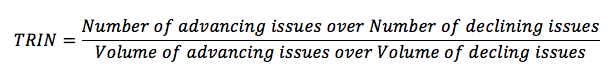
- The Arms index or short-term trading index (TRIN) is a measure of funds flowing into advancing and declining stocks. The index is calculated as :
An index value close to one suggests funds are flowing about evenly to advancing and declining stocks. Index values greater than one mean the majority of volume is in declining stocks, while an index less than one means more of the volume is in advancing stocks.
- Margin debt, besides indicating investor sentiment as described above, is also a useful flow of funds indicator. Increasing margin debt may indicate that investors want to buy more stock. Decreasing margin debt indicates increased selling.
- The mutual fund cash position is the ratio of mutual funds’ cash to total assets. During uptrends, fund managers want to invest cash quickly because cash earns only the risk-free rate of return and thus decreases fund returns. During downtrends, fund cash balances increase overall fund returns.
- New equity issuance (i.e. IPO) and secondary offerings (sales of additional shares by the issuer) add to the supply of stocks. Because issuers tend to sell new shares when the stock prices are thought to be high, increases in issuance of new shares may often coincide with market peaks.
F. Explain the use of cycles by technical analysts :
Cycle theory is the study of processes that occur in cycles, as many natural phenomena tend to do. Some technical analysts apply cycle theory to financial markets in an attempt to identify cycles in prices.
Some of the cycle periods favored by technical analysts are 4-year presidential cycles related to election years in the United States; decennial patterns or 10-year cycles; 18-year cycles; and 54-year cycles called the Kondratieff wave.
One of the more developed cycle theories is Elliott wave theory.
G. Describe the key trends of Elliott Wave Theory and the importance of Fibonacci numbers :
Elliott Wave theory is based on a belief that financial market prices can be described by an interconnected set of cycles. The cycle periods range from a few minutes (a “subminette” cycle) to centuries (a “Grand Supercycle”).
“Waves” refer to chart patterns associated with Elliott wave theory. In a prevailing uptrend, upward moves in prices consist of five waves and downward moves occur in three waves. If the prevailing trend is down, downward moves have five waves and upward moves have three waves. Each of these waves, in turn, is composed of smaller waves of the same general form.
The sizes of these waves are thought to correspond with Fibonacci ratios. Elliott wave theorists believe that the ratios of Fibonacci numbers are useful for estimating price targets. Ratios of consecutive Fibonacci numbers converge to 0,618 and 1,618 as the numbers in the sequence get larger. These two values are commonly used to project price targets.
H. Describe intermarket analysis as it relates to technical analysis and asset allocation :
Intermarket analysis refers to analysis of the interrelationships among the market values of major asset classes, such as stocks, bonds, commodities, and currencies. Relative strength ratios are a useful tool for determining which asset classes are outperforming others. After identifying attractive asset classes, an analyst can apply relative strength analysis to identify which assets within these classes are outperforming others. This approach is also useful for comparing the relative performance of equity market sectors or industries, and of carious international markets.
|
|
